Top 15 Minimalist Website Examples for Simple and Clean Web Design Inspiration
Web design is a critical part of website-building basics. It creates a first impression for your visitors and lays the foundation for your site navigation.
One of the most popular design styles is minimalism, which simplifies the user interface by erasing all unnecessary site elements. This helps improve website performance and user experience as well as create a clean look.
With this in mind, we’ll list 15 of the best minimalist website examples for your inspiration so you can build your own website today. For each example, we’ll briefly describe the website’s purpose and highlight its notable web design details.
We hope these minimalistic web design ideas can help you figure out how to design a website with a minimalist approach for commercial or personal use.
Download website launch checklist
15 Best Minimalist Website Design Examples
The following are the 15 best minimalistic website examples to help you learn more about minimalist website design.
1. Christy Anne Jones
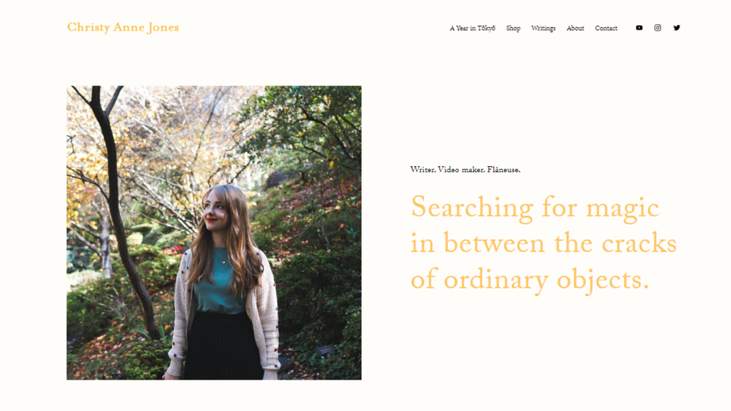
Christy Anne Jones is an Australian YouTuber whose videos focus on literature, creative writing, and travel. Examples of her content include daily vlogs, book reviews, and video essays. Having lived in Japan before, she also often discusses Japanese fiction and culture in her videos.
Her beautiful minimalist website sports a simple white, gold, black, and dark teal color scheme, using contrasting colors to make the text legible. It also uses a serif font that creates a classic feel. The abundance of white space also makes the few words and photos on display stand out.
2. Yonobi
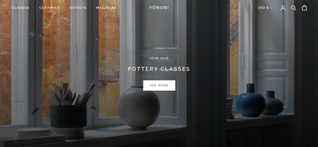
Based in Copenhagen, Yonobi is a ceramic shop offering various handmade ceramic products for sale. The store carries works of artists and small ceramic companies. In addition, it provides pottery classes held in its studio.
The site uses a grayscale color palette, alternating between displaying black text on white or light gray backgrounds and white text on darker photos or buttons. The images displayed have also been edited so that the colors appear muted to match the minimalist website design.
3. Sunday in Brooklyn
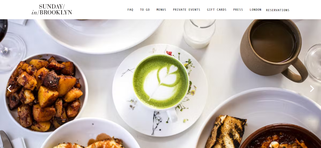
Sunday in Brooklyn is a neighborhood restaurant located in Brooklyn, New York. It specializes in American staples, specifically seasonal Brooklyn-style dishes. These range from brunch food like pancakes and shakshuka to soups, salads, and sandwiches.
This restaurant has a simple and clean website design with black text on a white background. There are also green illustrations and buttons, adding a pop of color throughout the entire website. The highlight of the site design is the slideshow of high-quality photos on the homepage, showcasing the restaurant, food, and customers.
4. EYRC
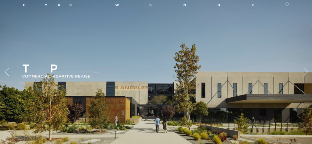
Formerly known as Ehrlich Architects, EYRC is an internationally acclaimed architecture firm in Southern California. The organization has constructed and designed various buildings for different purposes like educational, commercial, and residential.
EYRC’s site is a great example of a minimalist website design. It only shows letters or initials that turn into words when the cursor hovers over the menu or the image. This effect can encourage more people to explore different parts of the site to find out what the letters stand for.
5. By Experience
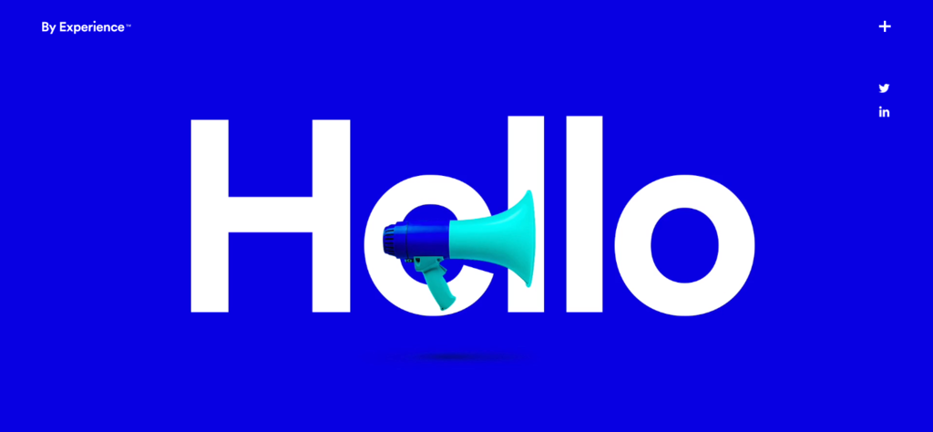
By Experience is a UK-based creative design agency that offers its clients various design and marketing solutions. Its services include branding, design, and creative marketing.
The agency’s minimal website has an eye-catching color palette of cobalt blue, cyan, and white. Upon accessing the homepage, visitors will be greeted by a large looping animation. It consists of a series of pictures explaining what By Experience is in just a few words. This is a great way to capture people’s attention while giving them a general idea of the business.
Suggested Reading
See more professional services website examples for your inspiration.
6. Humanrace
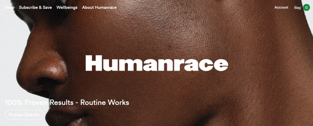
Founded by American music producer Pharrell Williams, Humanrace is a company producing gender-neutral skincare, bodycare, and suncare products. In addition, it offers ceramic trays and apparel – collaborating with Adidas to provide the latter.
The minimalist site features unique interactive product images. When the cursor hovers over an image, it changes to a slightly different picture of the same product, showing a different aspect of the product packaging. For example, the original image may depict a product with the lid on, but when a cursor hovers over it, the picture changes to one of the product with the lid off.
7. Meiwen See
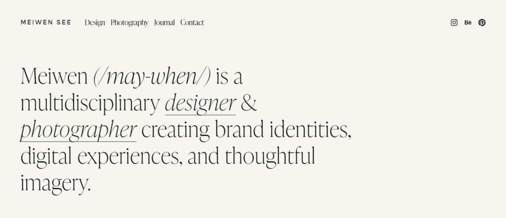
Meiwen See is a minimalist portfolio website of Meiwen Wang, a designer and photographer based in Los Angeles. Examples of projects she worked on include interior and architecture photography, weddings, restaurant menus, and hotel branding.
Wang’s minimal website design features a long homepage showcasing photos of her past projects. As visitors scroll down the web page, different images fade into view, giving off a clean yet dynamic feel. She also includes a mix of still and moving images, making her portfolio site feel more lively.
A website builder effortlessly creates similar designs. For example, Hostinger offers multiple templates tailored for crafting a minimalist portfolio. All templates are customizable, allowing you to experiment with fonts and colors. Explore Hostinger’s website design plans for more information.
8. Vorrath Woodworks
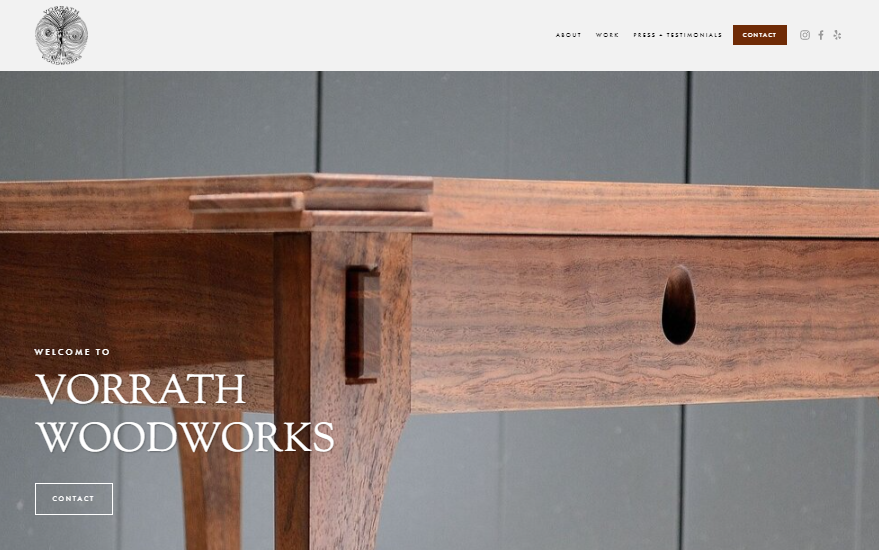
Based in California, Vorrath Woodworks is a team of fine woodworkers who have received formal training from The Krenov School of Fine Furniture. They offer custom, one-of-a-kind pieces, ranging from fine furniture to cabinetry.
True to its name, the wood theme is noticeable even in the site’s minimalist color scheme of black, white, and brown. The site’s long homepage is divided into several parts, including sections for its About Us description, project gallery, and client testimonials. This makes the essential information easily accessible, as the sections are available on a single page.
9. Peter McKinnon

Peter McKinnon is an internationally acclaimed photographer, filmmaker, entrepreneur, and YouTuber based in Toronto, Canada. He mainly creates videos centered around photography and filmmaking. He also sells various digital and physical products related to his niche.
His professional website combines full-screen high-quality photos and parallax scrolling to create an immersive browsing experience. The homepage is divided into multiple sections, each featuring a different image. Additionally, the minimalist site uses an all-caps sans-serif font for a clean and modern look.
10. Bridal Bliss
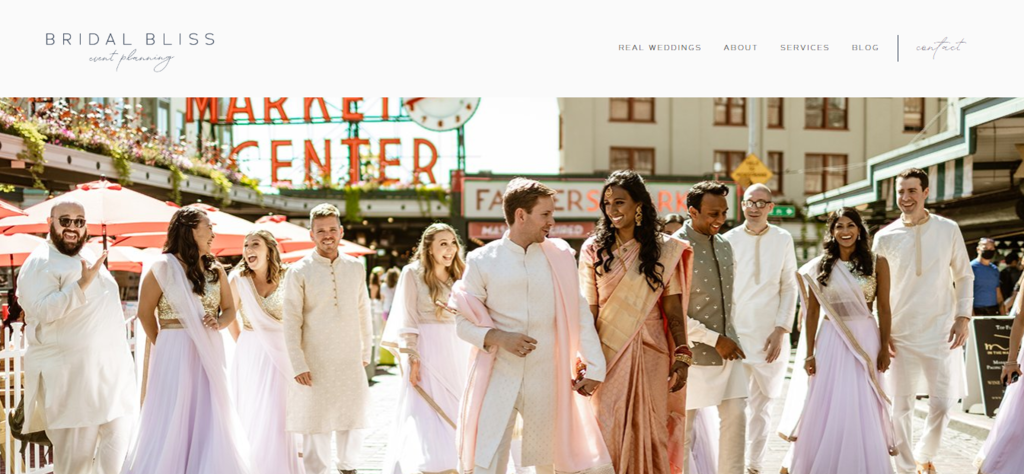
Bridal Bliss is a full-service wedding and event planning company catering to customers in the Pacific Northwest. The firm is critically acclaimed, having been featured in publications like Cosmopolitan and Glamour. It offers full-service wedding planning, day-of-wedding coordination, elopement packages, and special event assistance.
The minimalist website combines sans serif and cursive fonts to maximize legibility and elegance. Its abundance of white space and a color palette of navy blue, white, and light gray work together to create a clean and luxurious look. The highlight of the homepage is its screen-wide hero slideshow, showing past events the firm worked on.
11. The General Muir
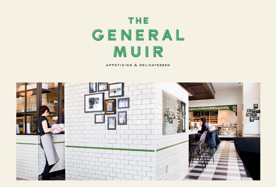
The General Muir is a modern American restaurant inspired by the classic New York Jewish deli. It serves a combination of traditional deli food and new dishes.
The site for this restaurant is an excellent example of how less is more. Upon accessing the minimalist website, a simple hero image of the restaurant greets site visitors. No animation, no slideshows – a straightforward and simple website design. It also uses black and green text on a clean broken white background.
12. Bathhouse
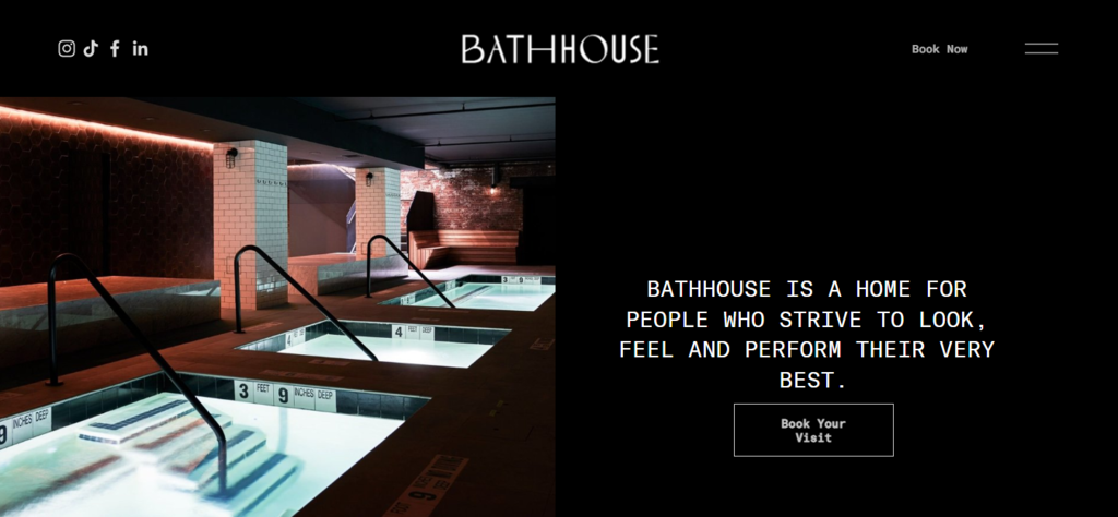
Bathhouse is a high-end spa located in Williamsburg, Brooklyn. It offers massage and body scrub treatments as well as various amenities such as a steam room, saunas, hammams, and thermal pools. Additionally, it features an on-site bar and restaurant serving guests before or after treatments.
Like the spa’s interior, the site is sleek and modern, featuring white sans-serif text on a black background. The minimal web design uses alternating text and image positions for each section on the homepage. If a section shows an image positioned on the left and the text on the right, the next section will feature the opposite.
13. Sadie’s Couture Floral
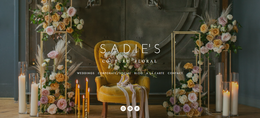
Based in Minnesota, Sadie’s Couture Floral offers one-of-a-kind floral arrangements and displays for various special occasions. These include wedding ceremonies and receptions, bridal parties, corporate functions, and social events.
The minimalist website is elegant in its simplicity. Its background is a full-screen slideshow of the florist’s past works – photos of colorful flower arrangements created for different events. The homepage also features a combination of white serif and sans-serif fonts with wide kerning and line spacing, which are great for legibility.
14. Sophie Kahn
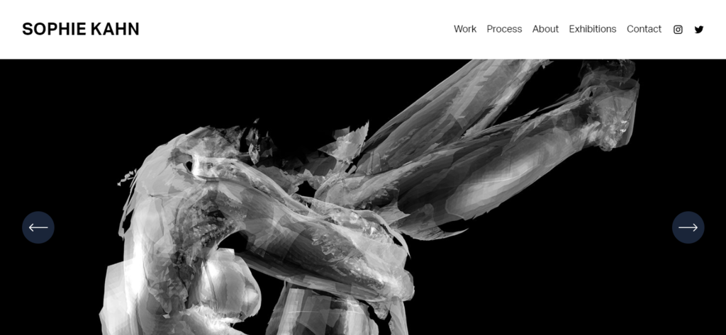
Sophie Kahn is an Australian artist and sculptor based in Brooklyn. She uses a 3D laser scanner to create various works of art like sculptures, videos, and prints. Through her work, she addresses the complexity of female bodies using technology.
Kahn offers an excellent example of an art portfolio website – simple, efficient, and straightforward. It sports a grayscale color palette, with black and gray text on a white background. The homepage displays a hero slider featuring images of Kahn’s fragmented sculptures. Users can navigate through the different pictures by clicking the slider’s left and right arrow buttons.
15. Tartine
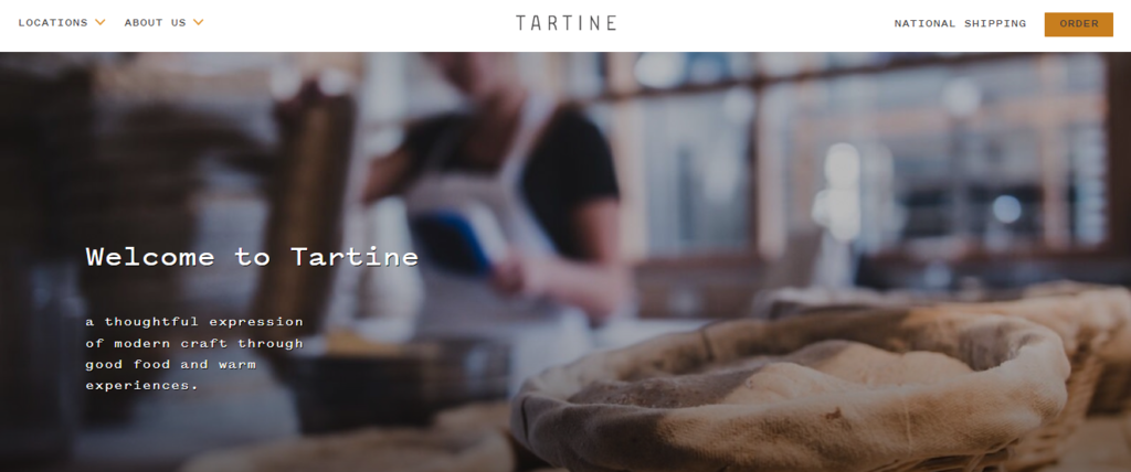
Tartine is a bakery and cafe with branches in San Francisco, Los Angeles, and Seoul. It serves baked goods, sandwiches, as well as hot and cold beverages, although menu items may vary according to the location.
The bakery keeps a minimal website design, mainly consisting of black text on a white background combined with accents of brown. The homepage displays a large hero image of baked goods with white text overlaid on top. One of its best design features is the masonry image collage showing high-quality photos of the bakery and its baked goods.
Why Choose a Minimalistic Website Design
If you’re still on the fence about minimalism after reviewing our list, take a look at some of the benefits of building a website with a minimal website design.
Efficient User Experience
By taking a minimalistic design approach, you can speed up your website’s load time. This is because there are fewer site elements to load than a feature-rich website. Improving site load time is an important part of website optimization and UX design, as many people will abandon a site if it takes too long to load.
A website with fewer design elements also means easier navigation. By only keeping the essential information, site visitors won’t feel overwhelmed by too many features or options. Therefore, it will take them less time to figure out where to find the information on your minimalist website.
Better Responsiveness
Besides improving user experience, a mobile-friendly website design is necessary if you want the site to perform well on search engine results pages (SERPs). In fact, Google has already switched to a mobile-first indexing approach.
Minimalist websites make it easier to implement responsive design. As there are only a few elements on the site, fewer objects will require shrinking or stretching when viewed through a mobile device.
Improve Product Focus
A minimalist web design approach reduces distracting and unnecessary elements. Keeping only a few necessary components on the site interface and providing plenty of white space lets you draw attention to the main product or content more easily.
This improves the site visitor experience and can lead to more conversions. After all, most people visit your site to view the main product or content. A minimalist website design helps them save time and reach their desired content quickly.
Reduce Informational Overload
A quick way to drive people away from your site is to bombard them with too many elements like flashy ads, promotional pop-ups, and unnecessary bright or moving visuals.
This is why presenting them with a clean website layout with minimal elements is crucial. Use a legible font, show a clear visual hierarchy, and offer plenty of space or room to breathe.
Create a clutter-free website that is user-friendly and easy on the eyes, making customers feel comfortable staying on the site. Minimize the number of colors you use and edit pictures if necessary to make colors appear less garish.
Suggested Reading
Check out our article on the best web design practices for more tips and tricks.
Conclusion
A minimalist approach in web design emphasizes site content and necessary elements while eliminating distractions. It uses limited website color schemes and plenty of negative space to improve site navigation, user experience, and speed.
Here are our final recommendations of the best minimalist websites to learn from:
- EYRC – a distinctive and minimalist website design that emphasizes initials with fade-in text.
- By Experience – large looping animation with bold typography serves as a unique and concise way to introduce the business to new site visitors.
- Humanrace – interactive and informative product photos provide different looks for products and their packaging.
- Vorrath Woodworks – a long homepage divided into several sections serves different types of information without making visitors navigate to other pages.
- Bathhouse – white text and vibrant pictures on a simple black background create a clean and sleek minimalist website design.
We hope these web design inspirations have helped you learn more about minimalism and come up with your own minimalist website ideas. When you’re ready, try out one of the best website builders for a quicker and easier site-building process.
With Hostinger Website Builder, you can create modern minimalist websites quickly and easily for ₹139.00/month.

Minimalist Website Examples FAQ
This section will answer some of the most commonly asked questions regarding minimalist website design examples.
What Exactly Is a Minimalist Website Design?
Minimalist website design is an approach that requires simplifying the interface by eliminating all site elements that are unnecessary and do not affect core user tasks.
At its core, this design strategy employs the less is more principle. It helps improve user experience, reduce distractions, and emphasize the website’s main content.
What Are the Common Features of a Minimalist Design?
The common features of the minimalist design include a focus on functionality, clean and simple lines, and a limited color palette.
These aspects are also reflected in web design. Common features of minimalist website design are limited or monochromatic color schemes, restricted elements, maximized white space, and large background images or videos.

Tashia is passionate about all things website development, digital marketing, and eCommerce. She strives to spread her knowledge and help people navigate the online world through her words, one article at a time.