How to Create a Website With Your Phone Using Hostinger Mobile Editor

If you want to learn how to create a website with your mobile phone, Hostinger’s mobile editor is just what you need. This browser-based website editor simplifies the web development process, enabling you to build mobile-responsive websites directly from your mobile device.
This article explains what a mobile editor is and how to use one effectively. We’ll show you how to leverage the mobile editor of Hostinger Website Builder and give you tips on successfully building a mobile-friendly website.
Download guide to using Hostinger
What Is a Mobile Editor?
A mobile editor is a specialized website builder that enables you to create and manage a website with your mobile phone.
Traditionally, mobile editors have had limited functionality, meaning most website development was done on a computer instead of a phone.
However, Hostinger Website Builder’s mobile editor is designed for simplicity and convenience. As one of the best mobile website builders, it eliminates the need for a desktop computer. This way, you can create professional websites on the go, right from your mobile device.
Hostinger’s Mobile Editor Features
Building websites with a smartphone makes web design and development accessible to anyone, regardless of their experience or skill level.
Hostinger Website Builder’s mobile editor has many features that make creating a website with a mobile device straightforward, such as:
- Sidebar editing menu. Access all the editing features from one sidebar menu without leaving the page or switching windows or tabs. This streamlines the smartphone website creation process.
- Drag-and-drop interface. The intuitive interface lets you move, resize, and edit site elements freely – simplifying overall mobile website management.
- On-page editing. Add text boxes, buttons, images, and videos to your site. This feature is particularly useful for those with limited technical skills who want to create a website.
- Customization. The site editor offers extensive customization options, from color schemes and fonts to buttons and animations. They ensure that your mobile site stands out.
- Navigation management. This feature enables you to easily manage your site’s navigation. You can add or remove pages, create dropdown menus, and even add links to your social media profiles.
- AI Writer. Improve your site’s search engine optimization (SEO) performance with SEO-friendly and unique AI-powered content.
- Analytics. Our mobile editor has built-in analytics tools that help you conduct mobile site traffic analysis and identify trends directly from your mobile phone.

How to Build a Website With a Phone Using a Mobile Editor
Creating a website with your mobile phone is straightforward with Hostinger Website Builder’s mobile editor. Here’s how to do it in eight easy steps:
1. Log In to hPanel
To start with smartphone web development, log in to hPanel.
If you’re not yet a user, purchase any of our web hosting or cloud hosting plans to get started, then follow these steps:
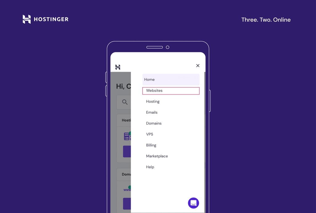
- Navigate to the three lines at the top-right corner and tap Websites.
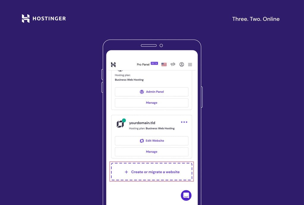
- Select the website you want to work on. To edit a website built with Hostinger Website Builder, hit Edit Website below its domain name.

- If you don’t have a website yet, tap Create or migrate a website.
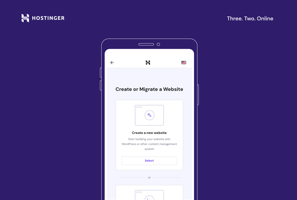
- Select Create a new website.
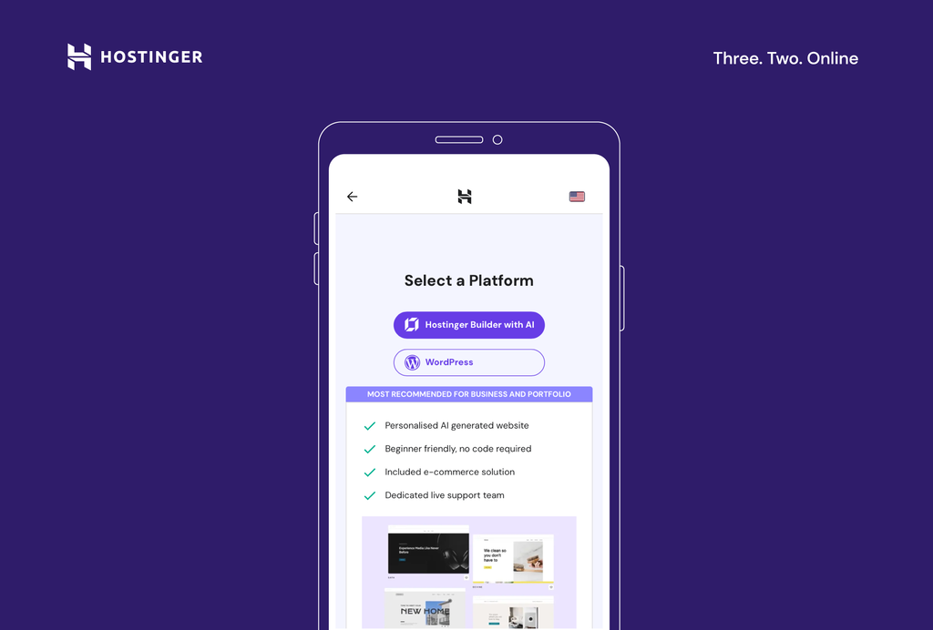
- Choose Hostinger Website Builder as your mobile web builder app.
Important! To launch a website, you need a domain name. After choosing your site-building tool, you will be prompted to select an existing domain or register a new one. It is also possible to start building your website from your phone without a domain name. This means you need to publish your site with a temporary domain. You can connect a custom domain later.
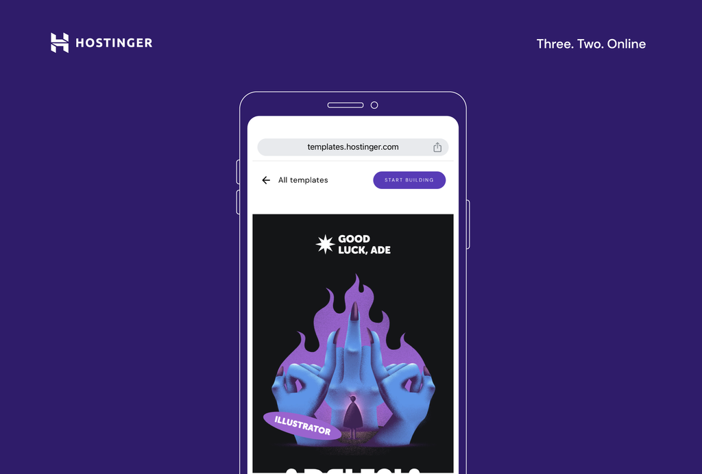
2. Choose a Template
The next step in creating your site is choosing a template. Hostinger offers a wide range of designer-made templates that are both mobile-friendly and customizable. You can either select a new template or use AI to generate a custom website template based on your needs.
Selecting a Designer-Made Template
- On the interface, choose the pre-made template option.
- Browse all the available templates by scrolling through the Templates page.
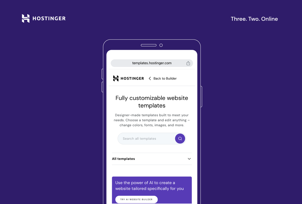
- Use the search bar to look for templates for particular niches or keywords, or view all the template categories by expanding the All templates sub-menu.
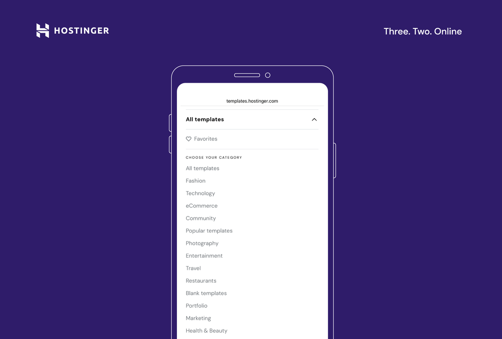
- Tap on the template to see how it looks in action. If you want to save it for later, use the heart icon to mark a template as a favorite. This way, they’ll appear in the Favorites section at the top of the page, under the All templates sub-menu.
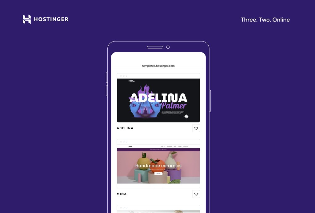
- Once you find a template that fits your site idea, tap Start building.
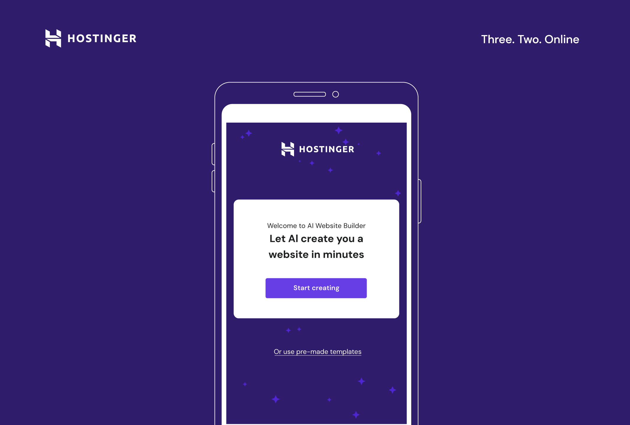
Using AI to Create a Template
- On the Hostinger Website Builder screen, tap Start creating.
- Begin by answering three simple questions about your site. Be as descriptive as possible – the progress bar will help you understand if you need to provide more information.
- Once you finish filling out the form, tap Create a website and the AI will create your personalized website template along with relevant content, like copy and images.
3. Add and Arrange Elements on the Page
The next step is to add and arrange elements on your pages. The editor enables you to drag and drop text boxes, images, and buttons to the desired place on the page. You can also resize and move them around to fit the design.
Additionally, it’s possible to duplicate, copy, and paste elements and move them forward and backward in the design to add more depth to your site. These tools help you create a responsive website that provides a high-quality experience on multiple devices.
Here’s how you can add elements to your website from your phone:
- Select a page section you want to edit. Access the main editing menu by tapping the icon in the bottom-right corner (round icon with three squares and a + sign).
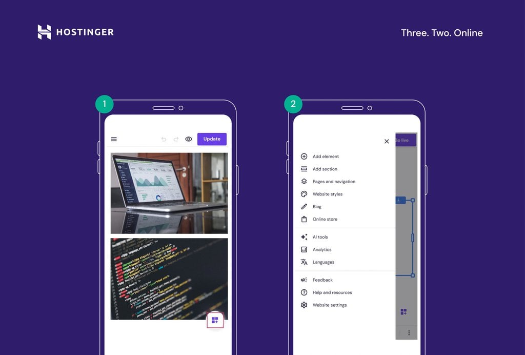
- Tap Add element to insert new elements to the page, like text boxes, buttons and icons, images, videos, contact forms, and maps.

- Move, resize, and edit website elements and sections as needed. Drag and drop them into place or use the arrow buttons in the bottom menu bar.
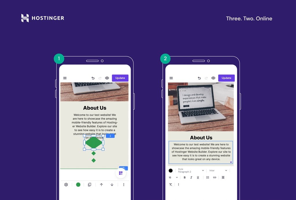
4. Customize the Website Design
Once you’ve added the necessary elements to the pages, it’s time to customize the design of your site. The mobile editor offers a variety of customization tools that let you change colors, fonts, and animations.
Start editing your site’s design by following these steps:
- Open the main editing menu by tapping the icon in the bottom-right corner (round icon with three squares and a + sign).
- Navigate to the Website styles menu and make changes to your website’s design and style.
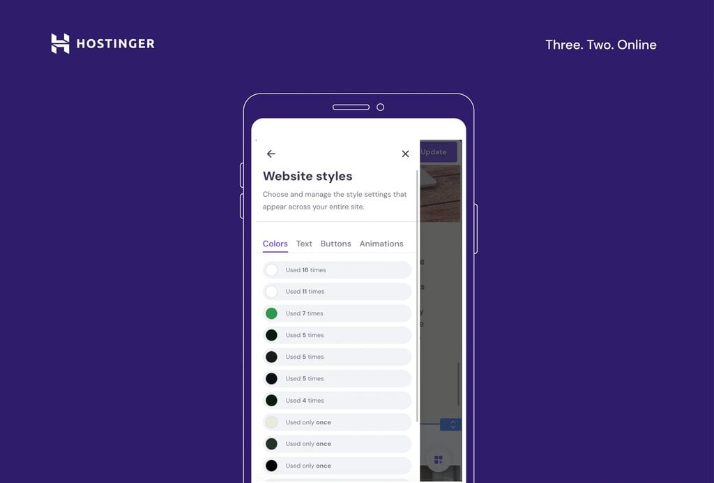
Pro Tip
In the Colors tab, you can see how many times different colors have been used in your overall web design. The Website Styles menu also lets you change the headline and body copy typography and define a primary button and element animation style. That way, you can ensure the site reflects your brand accurately.
5. Create and Manage Site Navigation
Managing your site’s navigation is crucial for a good user experience.
Hostinger Website Builder’s mobile editor makes adding or removing pages, creating dropdown menus, and adding links to your social media profiles easy:
- Head to the main editing menu by tapping the icon in the bottom-right corner.
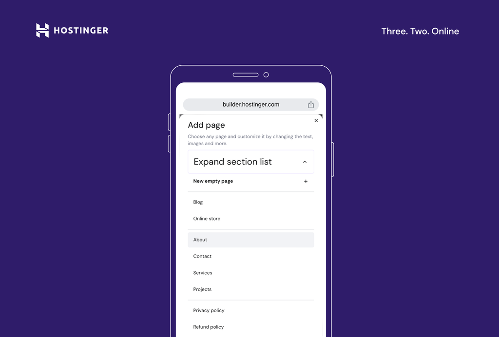
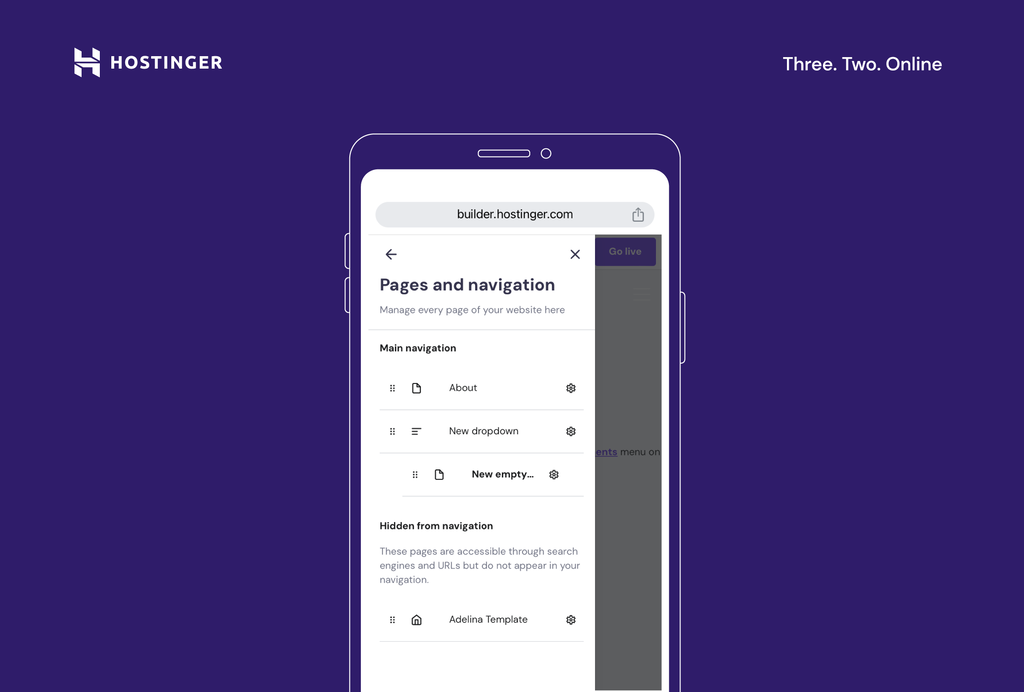
- Select Pages and navigation to manage your website pages, menus, and overall site navigation.
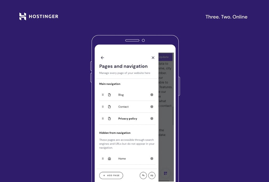
- Add new pages to your site by tapping the Add page button. You can select from existing page templates or create a new empty page.
- Edit the order in which your pages appear in the site menu by dragging the pages listed under Main navigation to the desired order.
- You can also create dropdown menus by clicking on the round icon with three lines and a + sign.
- Manage settings, like SEO metadata and page URLs, by clicking on the gear icon. You can also add passwords to restrict page access.

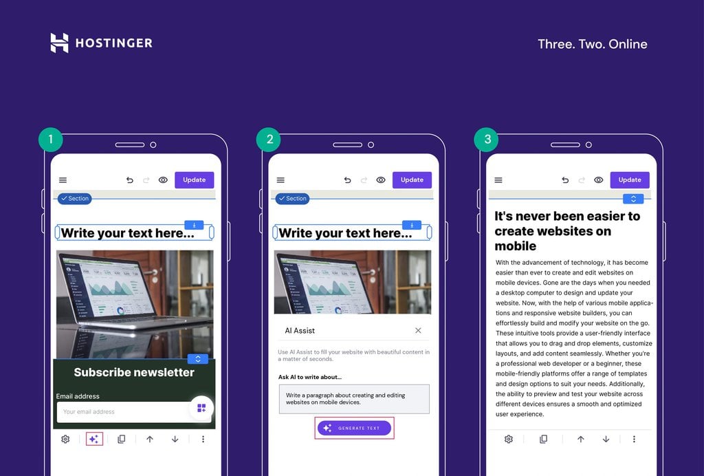
6. Write and Optimize Website Content With AI Writer
Creating and optimizing content is a central part of any website. Hostinger’s AI Writer tool helps you create SEO-friendly content that ranks well on search engines.
Start using the AI Writer to generate SEO-friendly content with minimal effort. On the editing interface of the mobile builder, add a text box element or select an existing one.
Then, tap the AI icon, describe your content, and generate the text. Note that your description needs to be at least 10 characters long, so be as detailed as possible to get the best results.
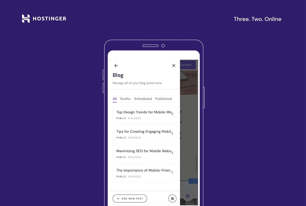
7. Add a Blog
Creating a blog for your site helps enhance content marketing and brand-building efforts. With Hostinger’s mobile editor, adding a blog to your website from your phone is easy:
- Open the main editing menu by tapping the icon in the bottom-right corner. Then, select Blog.
- Tap Start a blog.
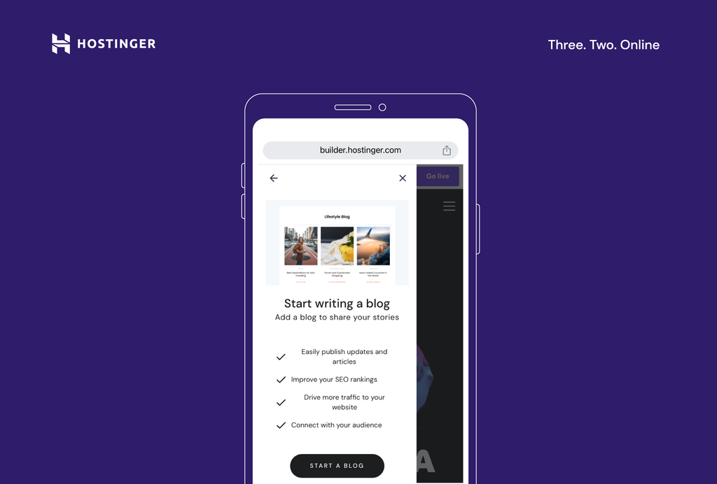
- The builder will generate a couple of empty blog posts in the Blog editor. Each mobile blog post acts as a new page on your site, so you can edit them like any other page.
- Click on the three dots to manage the post settings and edit, duplicate, delete, or unpublish a blog post.
8. Publish Your Site
Once you’re done editing, it’s time to publish your site. Use the preview function to check your site’s appearance before publishing. Simply tap the circular eye icon in the top menu bar.
When you are happy with the results, click the Go live button in the top-right corner.

You can publish your site with a temporary domain or connect a custom domain for a professional result.
If you need to make any changes to your site even after it’s live, simply open the editor and adjust the page. When you finish with the updates, tap Update in the top-right corner to make the changes live.
Note that while you are editing your site, any changes are saved automatically.
Once you have followed these steps and are familiar with the process of building a website using a mobile editor, you might also want to understand the expected timeframe for creating your own website. Knowing this will help you plan your project more effectively and set realistic goals.
Mobile Web Design Tips for a Successful Mobile Website
Creating a successful mobile website involves more than just adding elements and publishing your site. Good mobile-friendly website design is, first and foremost, user-centric.
Follow these best web design practices to ensure your site is both user and mobile-friendly:
Prioritize Mobile Website UI/UX
A mobile-responsive design ensures your website looks good and functions well on all devices. This is particularly important given the increasing number of mobile internet users who browse the web on their mobile devices.
Optimize Images and Media
Large images and media files can slow down your site, leading to a poor user experience. Compress your images and videos to improve load times. Faster website speed can boost user browsing times and contribute positively to search engine rankings.
Use Readable Fonts and Adequate Font Sizes
Readability is paramount when it comes to mobile website optimization. Choose legible fonts for smaller screens and maintain a font size that doesn’t require users to pinch and zoom. This results in a smoother navigation experience on mobile devices.
Create Concise Navigation Menus
Simplicity is key in mobile-first website design. This is especially true when designing navigation menus for mobile websites. Use clear and straightforward labels for each menu item, as a cluttered menu can overwhelm users. Consider implementing a hamburger menu format for mobile navigation to conserve valuable screen space.
Ensure Touch-Friendly Interactions
The interactive elements on your site, such as buttons and links, should be designed with touchscreens in mind. They should be easy to tap and not placed too closely together to prevent unintended clicks. This design approach guarantees a smooth experience for users navigating your site on touchscreen devices.
Optimize for Portrait Mode
Most users hold their phones vertically, so optimizing your site for portrait mode is essential. Ensure that your site’s layout and content are well-aligned with this orientation. This results in a comfortable and intuitive browsing experience, catering to how users naturally hold their phones.
Minimize Intrusive Pop-Ups
On smaller screens, pop-ups can disrupt the user experience. Avoid such elements to maintain a seamless browsing experience on your site. By reducing interruptions, you can extend user engagement and decrease the bounce rate, keeping visitors on your site longer.
Frequently Update and Maintain
Keep your website fresh by inspecting it for broken links, outdated content, and compatibility issues. A site that’s consistently updated and well-maintained not only contributes to a positive user experience but also reinforces a favorable brand image.
Suggested Reading
How to Make a Website From Scratch: A Beginner’s Guide
How to Design a Website: A Step-by-Step Guide from Idea to Launch
AI for Websites: Learn How Artificial Intelligence Can Help Improve Your Website
Best Free AI Website Builder
Conclusion
Creating a website with Hostinger Website Builder’s mobile editor is straightforward and efficient. With user-friendly features like browser-based editing and AI-powered tools, it’s a top choice for anyone looking to create a website on the go.
Remember that a well-designed mobile site isn’t just about aesthetics – it’s about providing a seamless user experience to site visitors.
Stay informed on the latest responsive website design trends, regularly update your website, and ensure it is easy to navigate on touchscreens for best results.
How to Create a Website With a Phone FAQ
Find answers to some of the most common questions about creating websites on your phone.
Can I Use Hostinger’s Mobile Editor on My Tablet?
Yes, Hostinger Website Builder is fully optimized for tablet use. With our site builder, you can create SEO-friendly mobile sites from any mobile device.
How Do I Use Hostinger’s Mobile Editor on My Mobile Device?
Log in to hPanel, select the website you want to edit, or choose to create a new one with Hostinger Website Builder. You can edit your website directly from the browser on various mobile devices.
Do I Need Web Design Experience to Use the Mobile Editor?
Hostinger Website Builder for phones is designed for users of all skill levels. The drag-and-drop interface makes creating a professional website without prior design experience easy. You only need your mobile device and a web hosting plan to get started.
Is Hostinger’s Mobile Editor Free to Use?
The mobile editor is free to use for all Hostinger users, regardless of your chosen hosting plan.
Can I Upload Images and Media Directly From My Phone?
Yes, you can upload images and media to your site directly from your phone. This simplifies the process of adding visuals to your site, as you don’t need to rely on a desktop computer or third-party tools.

Matleena is a seasoned Content Writer with 5 years of content marketing experience. She has a particular interest in emerging digital marketing trends, website building, and AI. In her free time, Matleena enjoys cups of good coffee, tends to her balcony garden, and studies Japanese. Follow her on LinkedIn


Comments
December 17 2023
I need a shoping website
December 19 2023
Certainly! We can help you get started. If you have specific questions or need assistance, feel free to contact our Customer Success Team and we'll guide you through the process ?
June 26 2024
I love this article. Just guide me develope a website of choice
June 27 2024
Hi there! We're glad you enjoyed the article. If you're looking to develop a website of your choice, we recommend starting with a clear plan for your site's purpose and content. From there, you can explore our tutorials and tools to help you build and customize your website step by step ;)
November 04 2024
I want to create sample website with code on my phone I can it?
November 06 2024
The Hostinger Website Builder is designed for ease of use with a drag-and-drop interface, but it doesn’t directly support custom coding (HTML, CSS, or JavaScript). If you want to create a sample website with your own code on your phone, you can use a hosting plan other than the Website Builder plan ;)